This Month
Corn vs. Oil
The ultimate battle!
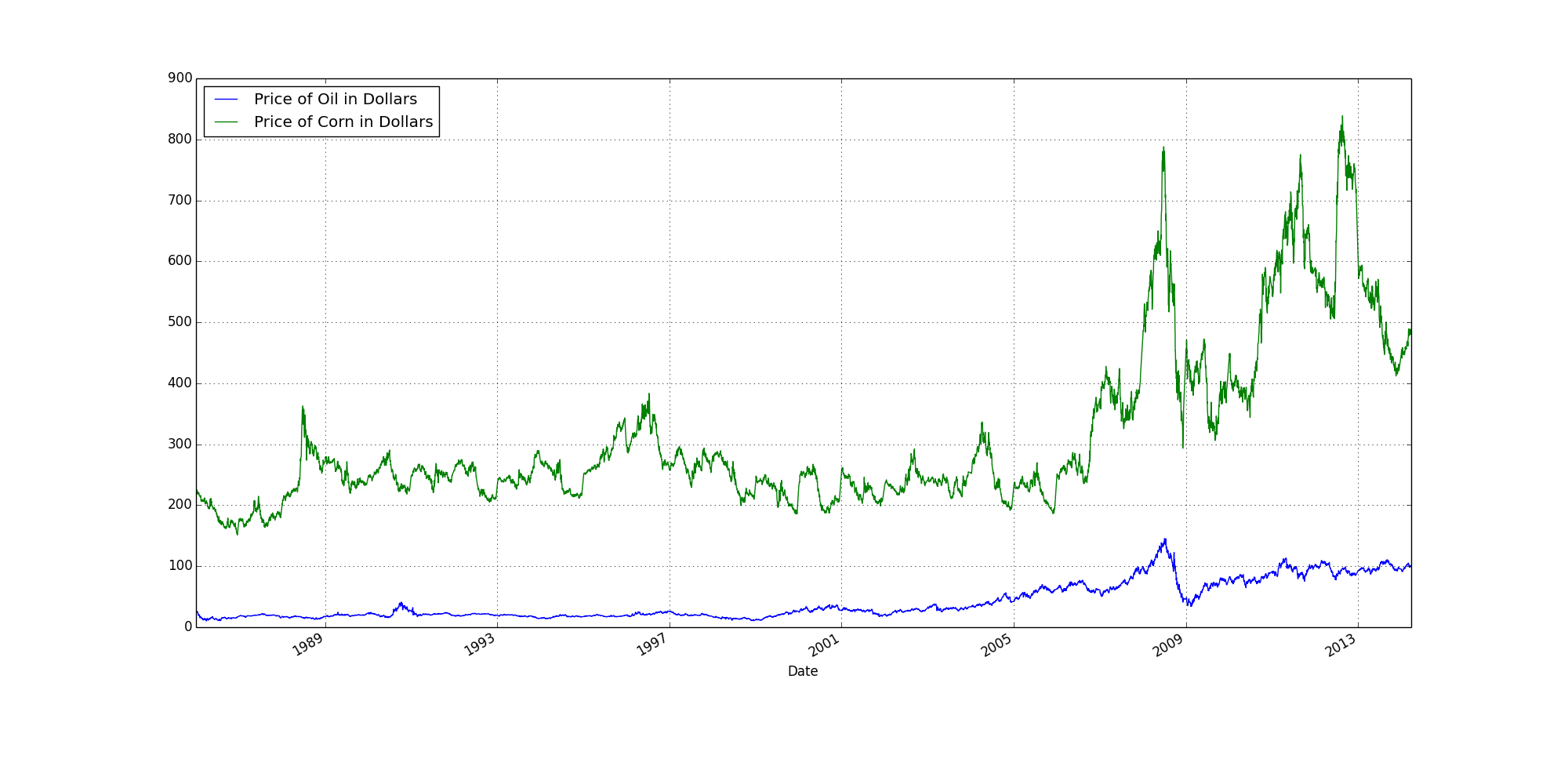
I always figured the price of corn was linked to oil.
A mutual spike around 2009 would seem to support that conjuncture.
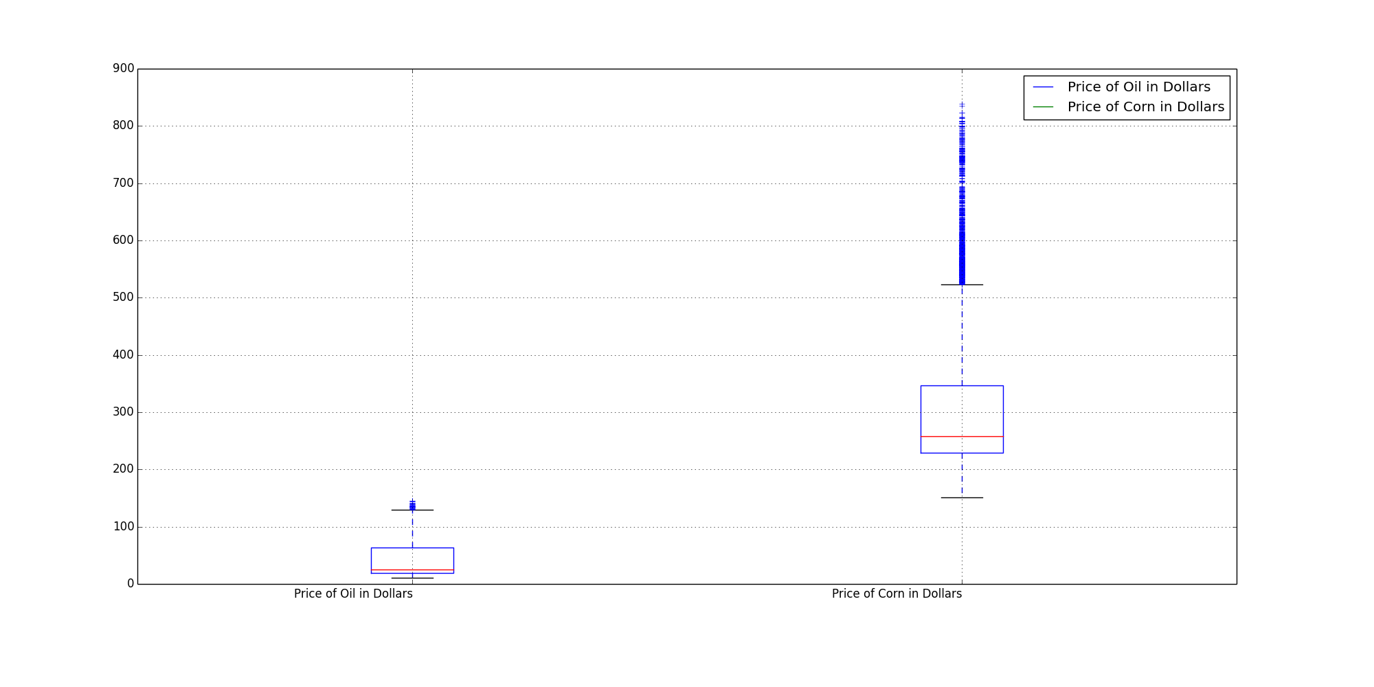
Box plots included mainly because it is so easy to crank them out.
They denote total trading range (and concentration of trading range) in this instance.
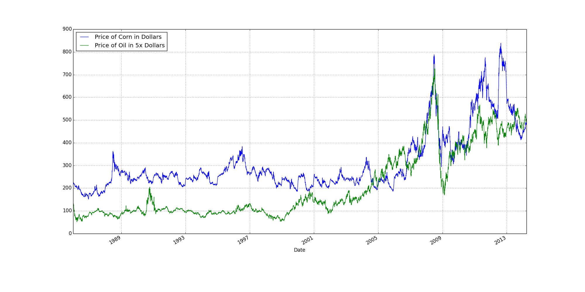
Above is the same data as the first line graph, except the price of oil has been increased by a factor of five. The overlap at 2009 is hard to miss.
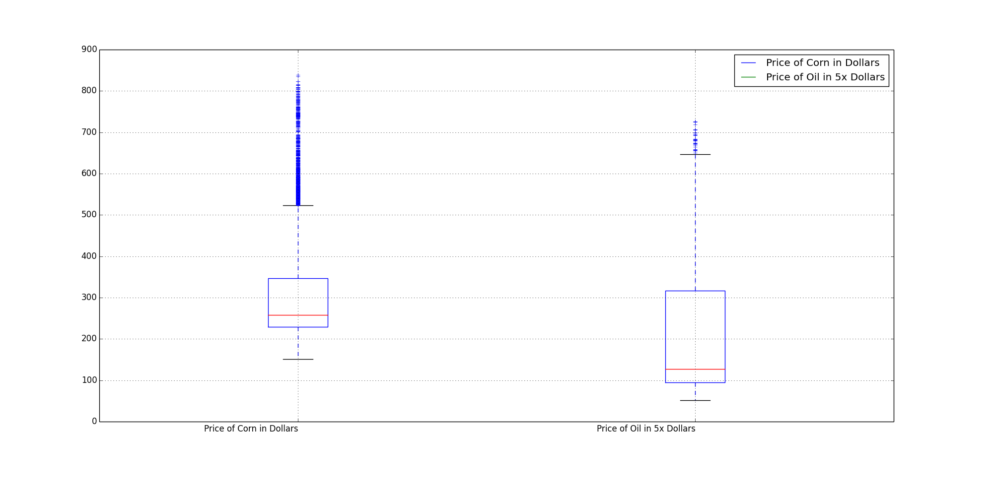
At 5x, the box plot doesn't match up as well, but better than it did before.
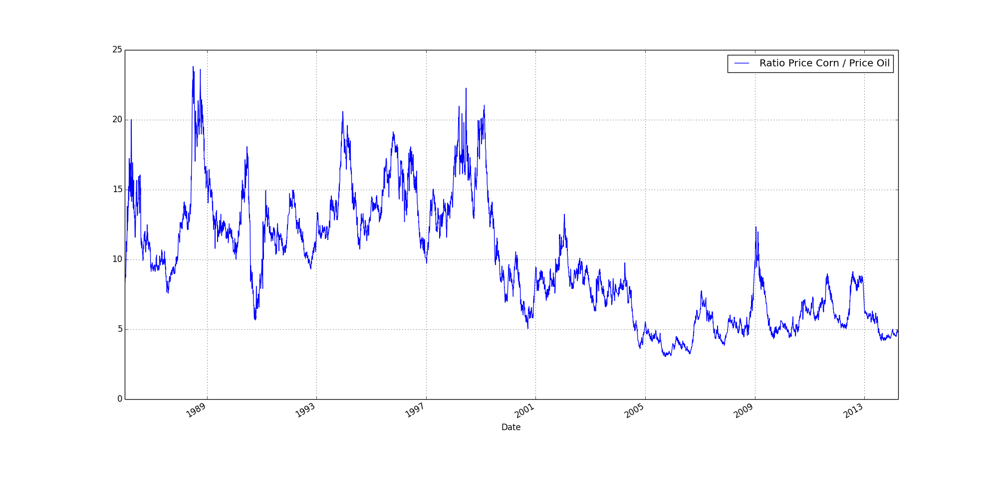
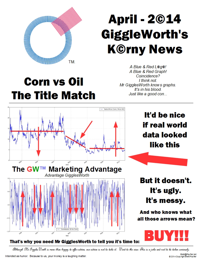
The above shows price corn divided by price oil.
(The price of the CZyear divided by the daily spot price of oil).
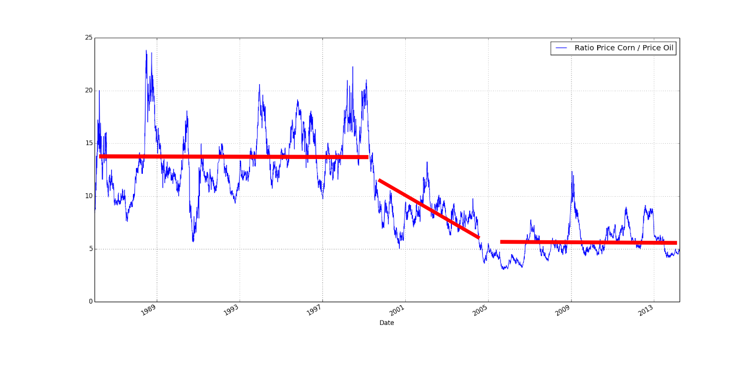
To my eye, there is an obvious recalibration of the ratio between 2000 & 2005.
An after effect of 9-11?
Or some legislative change?
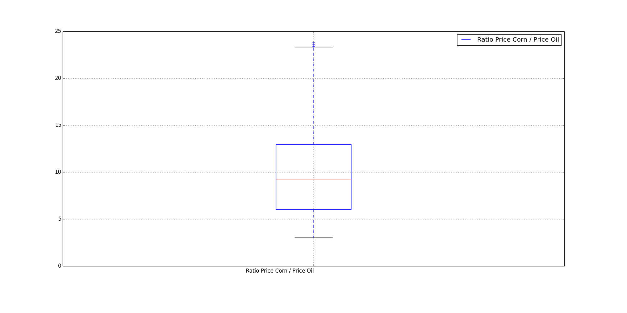
The box plot of the ratio provides little information to me.
However, it's large variance perhaps foreshadows the findings of the graph below...
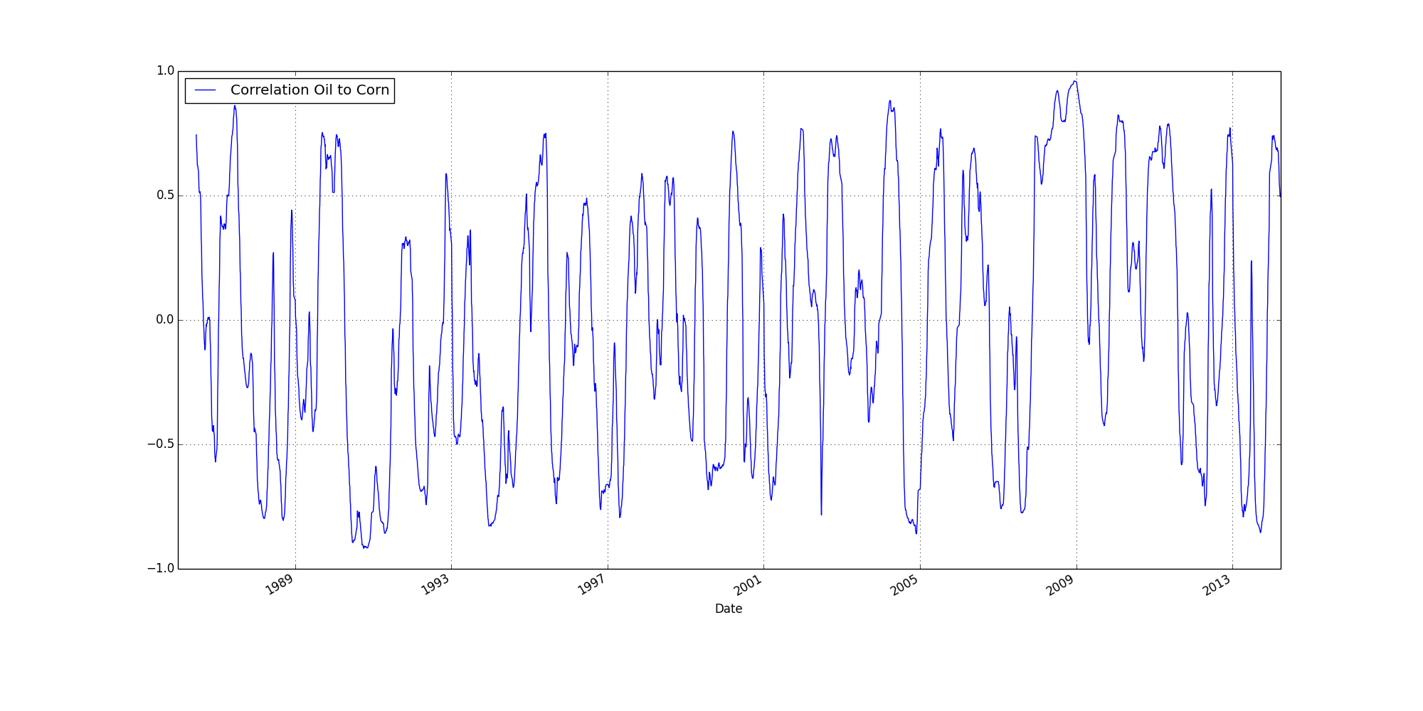
This a rolling 120 day correlation.
(The gap at the beginning is 119 missing data points.
Points 1-120, make data point 120.
Points 2-121, make data point 121.
What is derived is the correlation of those 120 data points.)
1 equals a positive correlation
-1 equals a negative correlation
0 equals randomness or no correlation
This graph is pure chaos -- no correlation taken to a whole new level.
If there was a long term correlation between corn and oil,
what we would see would be long patches of positive correlation.
Even with a recalibration at 2000-2005,
what we would see would be a preponderance of positive values before the event
(some gibberish during the recalibration)
and then positive values again after the event.
But this is not what is shown.
Chaos reigns supreme throughout.
So, um, yeah.
I had always assumed the price of corn correlated with the price of oil.
Looks like I was wrong.
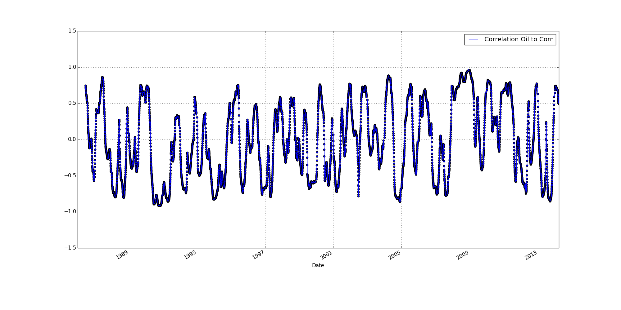
The above is a scatter plot (of the same correlation in the preceeding graph above).
After thinking on it a bit and looking at the graph a bit more,
the back and forth up and down seemed a little too convenient.
I wanted to make sure it wasn't a function of the graphing program.
But no, it's part of the data.
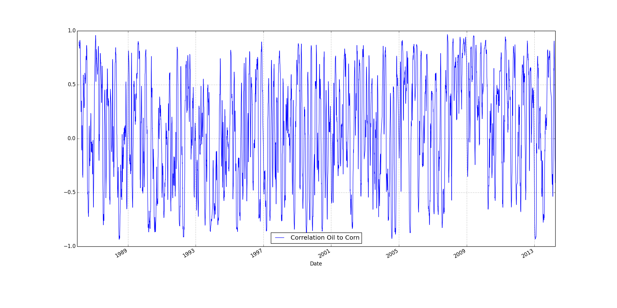
Shifting the rolling correlation to 30 days (per above), provides more up down.
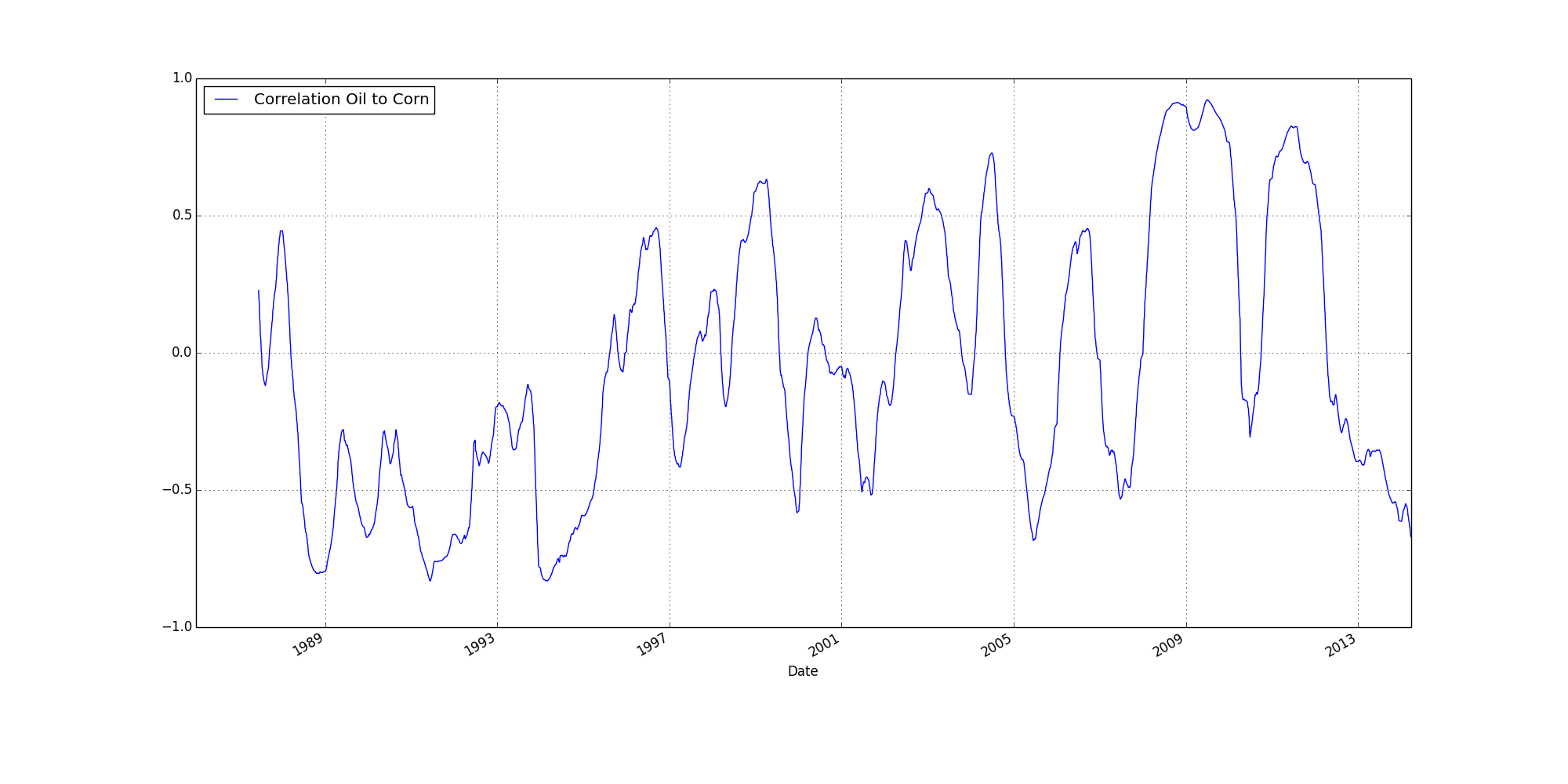
Whereas, shifting to 360 day rolling average, provides less up down.
Both of these results (less up down at 30, more at 360) are as to be expected (if one accepts that there is no correlation between the price of corn and oil).
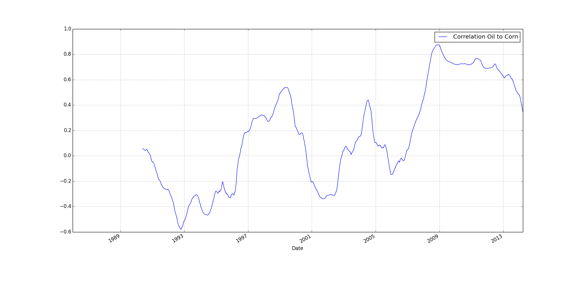
So, when we get to the above for a 1080 day rolling correlation (three years),
it's not too surprising when we find large areas of correlation (less up down, longer rolls).
It is perhaps noticable how large the correlation has been for the past few years.
So, looking at the data this way,
well,
maybe there is something to corn and oil being linked...
But if you want my honest opinion (read guess),
I'm going to guess there was some legislation that tied corn to oil,
But the effect of that legislation is starting to wane.
Or (and this might be even more interesting to consider),
perhaps the effects of the legislation only really kick in when corn (or is it oil) peaks,
or hits a certain high point price.
But whatever the case,
It's certainly too complex for me to tease apart at the moment.
 I always figured the price of corn was linked to oil.
 Box plots included mainly because it is so easy to crank them out.
 Above is the same data as the first line graph, except the price of oil has been increased by a factor of five. The overlap at 2009 is hard to miss.
 At 5x, the box plot doesn't match up as well, but better than it did before.
 The above shows price corn divided by price oil.
 To my eye, there is an obvious recalibration of the ratio between 2000 & 2005.
 The box plot of the ratio provides little information to me.
 This a rolling 120 day correlation.
 The above is a scatter plot (of the same correlation in the preceeding graph above).
 Shifting the rolling correlation to 30 days (per above), provides more up down.
 Whereas, shifting to 360 day rolling average, provides less up down.
 So, when we get to the above for a 1080 day rolling correlation (three years),